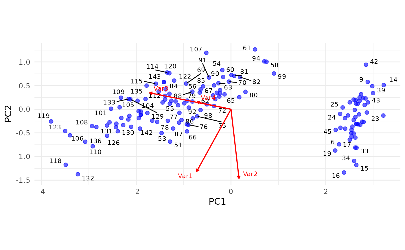
Biplot for PCA Objects (Enhanced with ggrepel)
biplot.pca.RdCreates a 2D biplot for a pca object, using ggplot2 and ggrepel
to show both sample scores (observations) and variable loadings (arrows).
Arguments
- x
A
pcaobject returned bypca.- y
(ignored) Placeholder to match
biplot(x, y, ...)signature.- dims
A length-2 integer vector specifying which principal components to plot on the x and y axes. Defaults to
c(1, 2).- scale_arrows
A numeric factor to scale the variable loadings (arrows). Default is 2.
- alpha_points
Transparency level for the sample points. Default is 0.6.
- point_size
Size for the sample points. Default is 2.
- point_labels
Optional character vector of labels for the sample points. If
NULL, rownames of the scores matrix are used if available; otherwise numeric indices.- var_labels
Optional character vector of variable names (columns in the original data). If
NULL, rownames ofx\$vare used if available; otherwise "Var1", "Var2", etc.- arrow_color
Color for the loading arrows. Default is "red".
- text_color
Color for the variable label text. Default is "red".
- repel_points
Logical; if TRUE, repel sample labels using
geom_text_repel. Default isTRUE.- repel_vars
Logical; if TRUE, repel variable labels using
geom_text_repel. Default isFALSE.- ...
Additional arguments passed on to
ggplot2orggrepelfunctions (if needed).
Details
This function constructs a scatterplot of the PCA scores (observations) on two chosen components
and overlays arrows for the loadings (variables). The arrow length and direction indicate how each
variable contributes to those principal components. You can control arrow scaling with scale_arrows.
If your pca object includes an $explained_variance field (e.g., proportion of variance per component),
those values will appear in the axis labels. Otherwise, the axes are labeled simply as "PC1", "PC2", etc.
Note: If you do not have ggrepel installed, you can set repel_points=FALSE and
repel_vars=FALSE, or install ggrepel.