autoplot.ref_fit
- autoplot.ref_assessment
- autoplot.ref_scores
- autoplot.ref_forecast
- autoplot.ref_derivative
- autoplot.ref_transition
- autoplot.ref_dynamics
Usage
autoplot.ref_fit(  object,  type = c("centiles", "trajectories", "support", "adaptation"),  outcome = NULL,  x = NULL,  newdata = NULL,  by = NULL,  data = NULL,  id = NULL,  time = NULL,  centiles = c(0.05, 0.25, 0.5, 0.75, 0.95),  ...)
autoplot.ref_assessment(  object,  type = c("calibration", "worm", "qq", "conditional"),  level = 0.95,  ...)
autoplot.ref_scores(object, type = c("profile", "heatmap"), id = NULL, ...)
autoplot.ref_forecast(  object,  type = c("fan"),  centiles = c(0.05, 0.25, 0.5, 0.75, 0.95),  ...)
autoplot.ref_derivative(object, type = c("velocity"), level = 0.95, ...)
autoplot.ref_transition(object, type = c("velocity", "innovation", "change"), ...)
autoplot.ref_dynamics(  object,  type = c("kernel", "calibration", "thrive"),  data = NULL,  id = NULL,  time = NULL,  level = NULL,  outcome = NULL,  x = NULL,  centiles = c(0.05, 0.25, 0.5, 0.75, 0.95),  anchors = c(0.05, 0.25, 0.5, 0.75, 0.95),  from = NULL,  horizon = 1,  thrive = 0.025,  ...)
Every autoplot() method returns a ggplot object styled with
theme_referent(). Individual observations are overlays, not part of
the fitted geometry.
Arguments
Section titled “Arguments”| Argument | Description |
|---|---|
object |
A fit, assessment, score table, forecast, transition, or dynamics object. |
type |
Plot kind. |
outcome |
Outcome name for multi-outcome fits. |
x |
Covariate mapped to the x-axis (default age if present). |
newdata |
Observations to overlay or to classify. |
by |
Optional grouping factor for faceted charts. |
data |
Visit-level data for trajectory and dynamics-calibration plots. |
id |
Subject identifier column. |
time |
Time column. |
centiles |
Probability levels for centile and fan charts. |
... |
Unused. |
level |
Coverage of the envelope on the Q-Q and worm plots, of the pointwise interval on a velocity plot, or of the correlation interval around a thrive line. |
anchors |
Starting centiles for type = "thrive". |
from |
Anchor times for type = "thrive" (default: a grid overthe reference range). |
horizon |
Forward step(s) for type = "thrive"; a vector traces acontinuous path rather than a single segment. |
thrive |
Conditional centile of the step for type = "thrive";0.5 gives the pure regression-to-the-mean path. |
Details
Section titled “Details”For a ref_fit:
"centiles": the fitted conditional distribution alongx(median, dashed outer centiles, and shaded bands), optionally faceted by a factor covariate and withnewdataoverlaid as points."trajectories": the centile chart with subject paths fromdatadrawn over it."support": wherenewdatafalls relative to the reference support (histogram ofxcoloured byref_support()status)."adaptation": location offsets (with standard errors) estimated byref_adapt().
For a ref_assessment, "calibration" plots observed against nominal
coverage, "conditional" the largest fitted drift of z against each
numeric covariate (factor levels are in the table only), and "qq" / "worm" the ordered Z scores against their
expected normal order statistics, raw or detrended (observed minus
expected), inside the envelope a calibrated model implies. Under a
correctly specified model the held-out centiles are iid uniform, so
the i-th ordered centile is Beta(i, n - i + 1): the pointwise band is
its normal transform in closed form, and the simultaneous band uses
equal local levels (Aldor-Noiman et al. 2013, Am. Stat. 67:249) with
the common local level calibrated by Monte Carlo so the whole ordered
sample stays inside with probability level. The corner tally names
both bands, since about 1 - level of the points are expected outside
the pointwise band even when the model is right.
For a ref_dynamics, "kernel" draws the fitted process correlation
against lag, "calibration" draws the same Q-Q chart of held-out
innovation Z from ref_transition() on data (which needs data,
id, and time), and "thrive" overlays conditional forecast
quantile paths on the centile chart. A thrive line starts on the
anchors centile at each time in from and follows the thrive
quantile of the forecast distribution horizon time units later; it is
ref_forecast() on a grid of one-visit histories, so the shaded band
is the level interval implied by the standard error of the estimated
process correlation. Paths whose lag falls outside the range the
dynamics were estimated on are drawn dotted.
For a ref_derivative, "velocity" draws the chart velocity of each
centile against time with its pointwise delta-method interval. That
interval is the sampling error of the fitted coefficients; it does not
cover the bias of the spline itself, which dominates when the basis
dimension k of the time smooth is too small. The subtitle says so.
A ggplot.
Examples
Section titled “Examples”ref <- ref_simulate(150, seed = 1)fit <- ref_fit(ref_spec(ref_gaussian(), ~ s(age, k = 5) + sex), ref, "y")autoplot(fit, type = "centiles", by = sex, newdata = ref[1:20, ])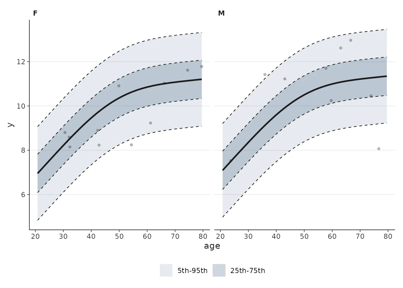
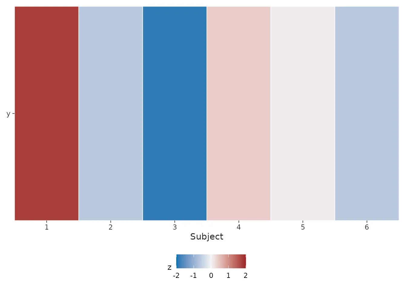
sc <- predict(fit, newdata = ref[1:6, ], uncertainty = "conditional")autoplot(sc, type = "heatmap")