This vignette provides a comprehensive walkthrough of the new plotting helpers bundled with DKGE. Our approach involves simulating a small dataset with known factorial structure, fitting the DKGE model, and then showcasing what we call the “Five Fundamentals” — a core set of diagnostic visualizations that together provide essential insights into model quality and interpretability.
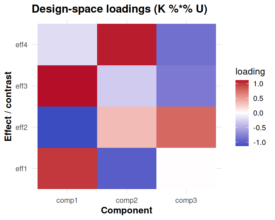
These five fundamental diagnostics include: first, a scree plot enhanced with one-SE overlay for rank selection guidance; second, an effect-space loadings heatmap that reveals how design factors contribute to each component; third, subject contribution plots that decompose both weights and energy across individuals; fourth, subspace stability analysis using principal angles to assess cross-validation robustness; and finally, anchor-level information maps that display both Haufe transformations and leave-one-covariate-out (LOCO) importance scores.
All plots are designed with a unified visual styling achieved through
theme_dkge(), ensuring consistency across the entire
analysis workflow. Moreover, these individual plots can be seamlessly
composed into a single comprehensive dashboard using the
dkge_plot_suite() function.
Prerequisites
The information-map plotting functions provide enhanced labeling
capabilities by optionally utilizing the ggrepel package to
annotate top anchors with non-overlapping text placement. When
ggrepel is not available in your environment, the code
gracefully falls back to standard base text labels to ensure
functionality is maintained.
Simulate a toy dataset
We begin by generating a small synthetic dataset manually. Each subject has a diagonal design matrix (one column per effect), and we add modest signal plus noise so the latent components are recoverable but not trivial. Using this construction keeps the vignette self-contained and avoids dependencies on specialised simulators while still providing deterministic ground truth for the plots.
q <- 4L   # number of effects
P <- 30L  # clusters (voxels) per subject
S <- 8L   # subjects

make_subject <- function(id) {
  design <- diag(q)
  colnames(design) <- paste0('eff', seq_len(q))
  signal <- matrix(rnorm(q * P, sd = 0.4), nrow = q)
  noise <- matrix(rnorm(q * P, sd = 0.2), nrow = q)
  dkge_subject(signal + noise, design = design, id = paste0('sub', id))
}

subjects <- lapply(seq_len(S), make_subject)
K <- diag(q)
fit <- dkge(subjects, K = K, rank = 4, w_method = 'none')
Auxiliary objects
We now produce helper objects used in later sections. In a production
pipeline you would typically obtain LOSO-aligned bases via
dkge_contrast(..., align = TRUE) and real information maps
from dkge_info_map_haufe() /
dkge_info_map_loco(). Here we synthesise lightweight
placeholders so the plots remain deterministic.
To illustrate subspace stability we create a few perturbed versions of the fitted basis and re-orthonormalise them in the -metric.
# In practice you can retrieve per-fold bases from
# dkge_contrast(..., align = TRUE)$metadata$bases.
# Here we synthesise a few perturbations for illustration.
fit_U <- fit[['U']]
bases <- replicate(4, {
  perturb <- matrix(rnorm(length(fit_U), sd = 0.02), nrow = nrow(fit_U))
  dkge_k_orthonormalize(fit_U + perturb, fit[['K']])
}, simplify = FALSE)
base_labels <- paste0('base', seq_along(bases))
The information-map visualization requires anchor-level results from either Haufe transformation analysis or leave-one-covariate-out (LOCO) importance calculations. Since we are working with a synthetic example for demonstration purposes, we create mock anchor vectors that simulate these outputs. In a real-world analysis, you would replace these placeholder vectors with actual Haufe or LOCO results computed from your fitted model.
Individual plots
Scree
# For illustrative purposes we annotate the scree at component 3.
# In a real analysis you would obtain this optimal rank from dkge_cv_rank_loso()
# or dkge_cv_kernel_rank() cross-validation procedures.
one_se_pick <- 3
dkge_plot_scree(fit, one_se_pick = one_se_pick)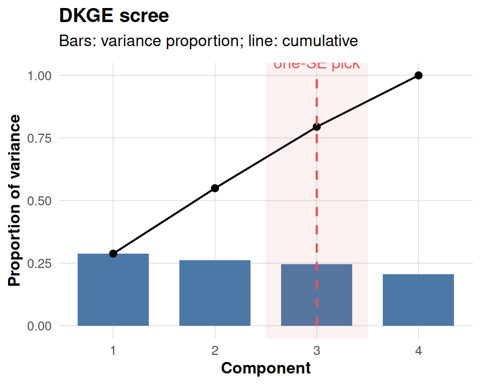
Subject contributions
dkge_plot_subject_contrib() returns two linked panels.
The left panel simply visualises the subject-level weights that were
used while fitting the model (fit$weights). Those weights
depend on the w_method argument passed to
dkge(): in this vignette we deliberately chose
w_method = "none", so each subject keeps unit weight and
the bars are all equal to one. Switching to "mfa_sigma1" or
"energy" would display the corresponding MFA-style or
energy-based weighting actually used in the eigensolve. The heatmap on
the right shows how much norm (“energy”) each subject contributes to the
selected components after those weights have been applied.
contrib <- dkge_plot_subject_contrib(fit, comps = 1:3)
contrib$weights + contrib$energy + patchwork::plot_layout(widths = c(1, 2))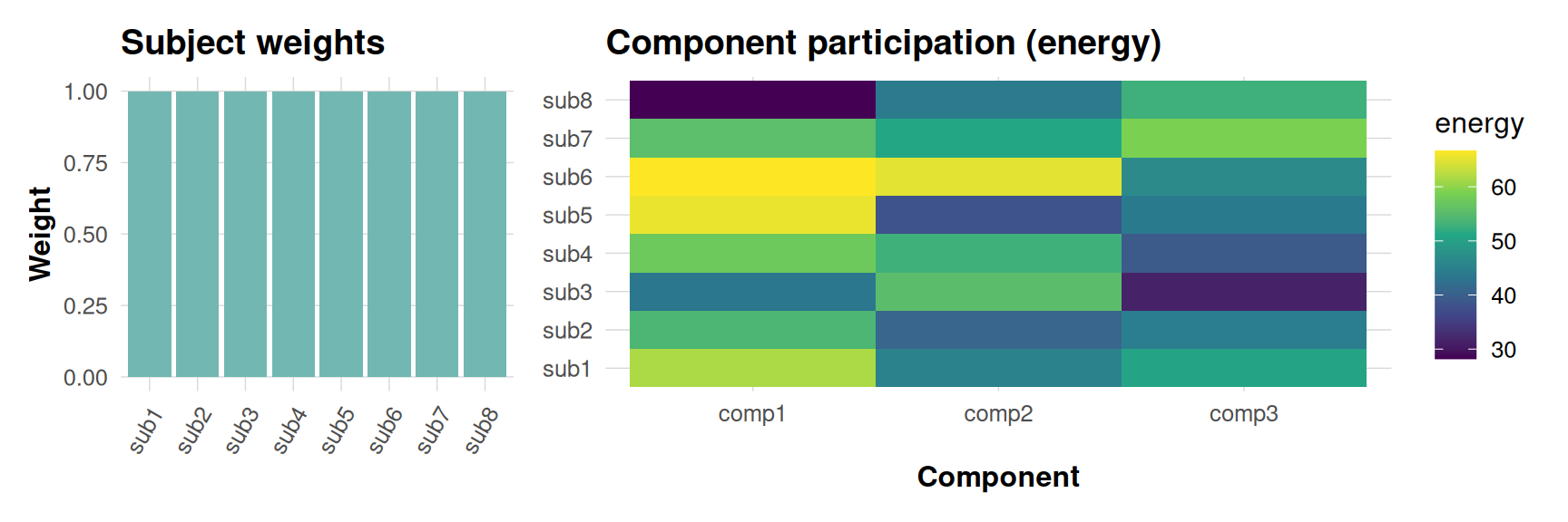
Subspace stability
This diagnostic compares each cross-validated basis (or synthetic perturbation here) against a consensus basis by computing principal angles in the metric. Smaller angles mean that a base reproduces the consensus component more closely, so parallel lines near zero indicate a stable subspace, whereas large excursions highlight folds or components that deviate materially.
dkge_plot_subspace_stability(bases, K = fit[['K']], labels = base_labels)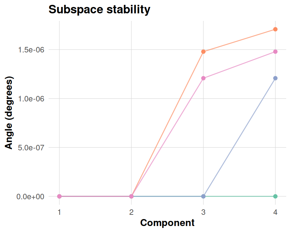
Information maps
The information panels translate component patterns back to anchor space. The Haufe transformation re-expresses each component in terms of observable anchor weights, making it easier to interpret which clusters drive a latent effect once you account for the whitening in the eigensolve. The LOCO panel measures how the objective would drop if each anchor were removed in turn, so tall positive bars flag anchors that materially support the fit. Together they provide a bridge between latent structure and spatial attribution.
panels <- dkge_plot_info_anchor(info_haufe = fake_haufe,
                                info_loco = fake_loco,
                                top = 5)
panels$haufe + panels$loco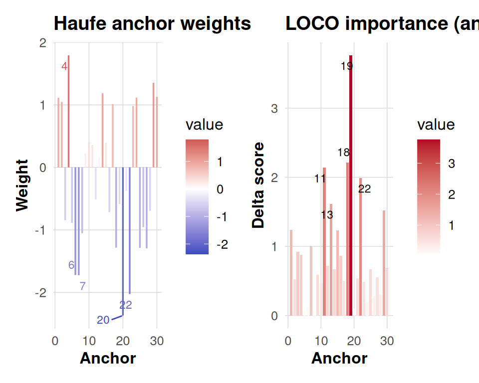
The “Five Fundamentals” dashboard
dkge_plot_suite(fit,
                one_se_pick = one_se_pick,
                comps = 1:3,
                bases = bases,
                consensus = fit[['U']],
                base_labels = base_labels,
                info_haufe = fake_haufe,
                info_loco = fake_loco,
                top = 5)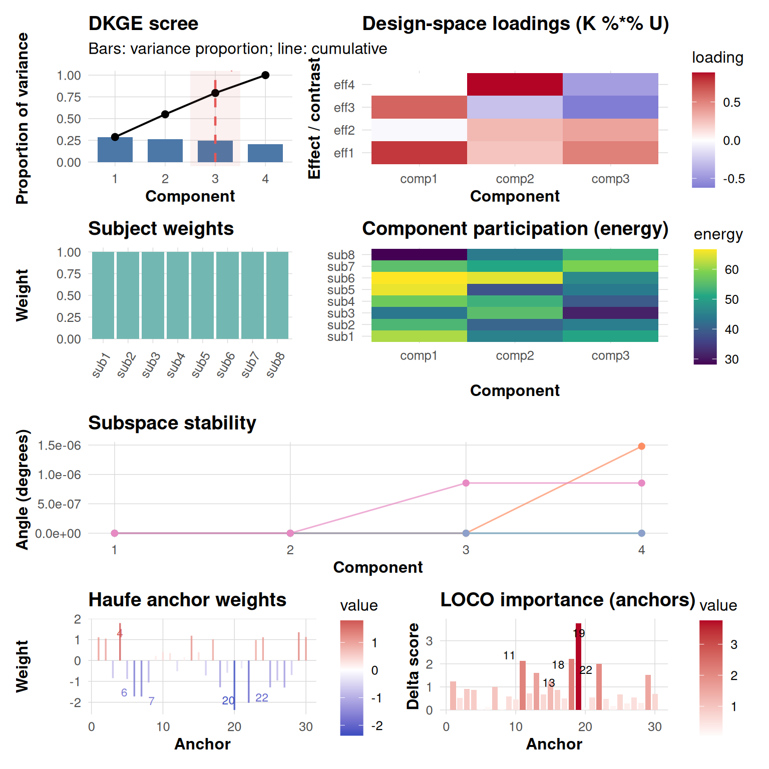
The dkge_plot_suite() function intelligently arranges
all five fundamental diagnostic panels into a coherent,
publication-ready dashboard with consistent spacing and visual
hierarchy. When you provide real Haufe transformation and LOCO
importance results, the function seamlessly incorporates these into the
final row of visualizations. Conversely, if these anchor-level analyses
are omitted from your call, the layout automatically adapts by placing
an informative placeholder message in their position, ensuring the
dashboard remains structurally sound.
Saving the dashboard
dkge_plot_suite(fit,
                bases = bases,
                consensus = fit[['U']],
                base_labels = base_labels,
                info_haufe = fake_haufe,
                info_loco = fake_loco,
                save_path = "dkge_dashboard.png",
                width = 10,
                height = 10)
Summary
The DKGE plotting helpers are intentionally designed with computational efficiency and visual clarity as primary goals. They operate exclusively in the low-dimensional design space rather than in high-dimensional voxel space, ensuring fast rendering even for complex models. All functions inherit a cohesive visual theme that maintains consistency across different plot types, while simultaneously supporting both rapid exploratory inspection and publication-quality dashboard generation.
These plotting tools offer considerable flexibility to accommodate
different analytical workflows. For interactive exploration and
hypothesis generation, you can embed individual diagnostic panels
directly inline within your analysis notebooks. When conducting formal
model quality assurance, you can capture high-resolution snapshots using
standard R graphics functions like png() or
ggsave() for documentation and reporting purposes. For more
comprehensive presentations, you can extend the basic five-panel suite
by incorporating additional visualization rows — such as brain rendering
panels showing voxel-level activations — through the powerful layout
capabilities provided by the patchwork package ecosystem.
Happy plotting!