What Is This Page For?
Use this page to choose a visual direction before you retrofit or create vignettes. You can tune one parameter at a time and immediately see the effect on hierarchy, contrast, and page rhythm.
Start with family and preset, then tune style, then adjust content width. That order gives the fastest path to a coherent page.
How Do You Use It?
- Pick a family for color character (the four chips show its tones).
- Pick a direction: warm homage or cool interaction.
- Toggle style intensity to set structural emphasis (marker + rule weight).
- Adjust content width to match prose density.
A900 A700 A500
A300
family=red | preset=homage | style=minimal | width=66ch
What Does Each Control Change?
-
family: accent hue and contrast character for links, rules, the nested-square marker, and plot palettes (the four chips above show the active family’s tones). -
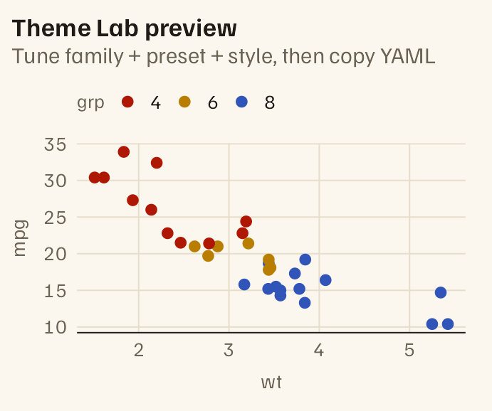
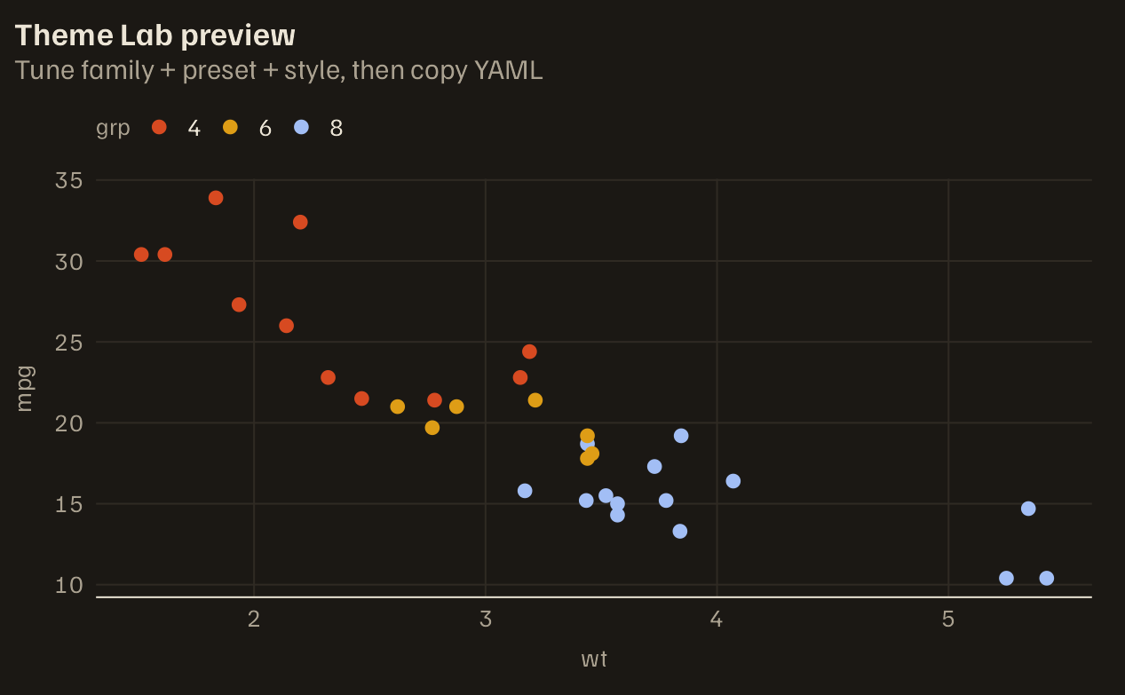
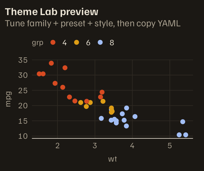
preset(direction): warm homage (cream ground, serif body, light code) vs cool interaction (grey ground, grotesk, dark code). -
style: structural weight (minimalorassertive). - Content width: the reading measure in
chunits, for this preview only. The theme sets it (66ch in homage, 64ch in interaction); it is not a format option.
Can You Validate The Palette Quickly?
# the format sets the albersdown.family option to the vignette's family
pal <- albersdown::albers_palette(getOption("albersdown.family", "red"))
stopifnot(
  identical(names(pal), c("A900", "A700", "A500", "A300")),
  all(nzchar(unname(pal)))
)
knitr::kable(data.frame(tone = names(pal), hex = unname(pal)), format = "html")| tone | hex |
|---|---|
| A900 | #760906 |
| A700 | #AE1703 |
| A500 | #D74A21 |
| A300 | #F7A885 |
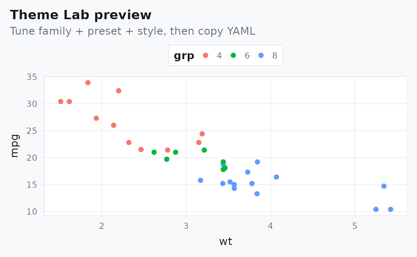
Example Plot
mtcars$grp <- factor(mtcars$cyl)
stopifnot(length(levels(mtcars$grp)) >= 3)

ggplot(mtcars, aes(wt, mpg, colour = grp)) +
  geom_point(size = 2.2) +
  albersdown::scale_color_albers() +
  labs(
    title = "Theme Lab preview",
    subtitle = "Tune family + preset + style, then copy YAML"
  )